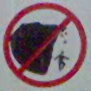
 This gem found at the Eagles Nest in Bunurong Marine National Park, between Inverloch and Cape Paterson.
…
Silly WordPress really wants very badly to truncate these images.
…
“Fly, you fools!”
…
The only solution to the truncation issue appears to be LOTS MORE TEXT! If anyone knows how to cleanly and appropriately force WordPress to do a break-clear or similar, so that images longer than a post don’t get truncated and mess up the formatting of subsequent posts, please coment or otherwise tell me.
E and I had an excellent day yesterday driving down random and nameless roads around Cape Paterson, looking for various things including dinosaur bones and long vanished shipwrecks, or even the beaches upon which the aforementioned wrecks allegedly occurred, and having fun despite mostly only finding dust, slime and infinite midges.
I am wishing now that I’d taken a photo of the one piece of shipwreck we found: a mysterious old metal wheel, about the diameter of a basketball, so rusted as to be fused onto the rocky shore. Signs around wreck beach indicated a historical marker, but all we found was the wheel and a large, important-looking piece of rock set in a concrete plinth, with absolutely no adornment on any side. Very odd.

It’s not WordPress that’s causing you formatting angst, it’s something to do with your CSS. The quickest fix I can come up with is to add an ‘overflow: auto;’ to your ‘post’ class, and a ‘clear: both;’ to your ‘commentPos’ class.
I concur with Dave, with the added extra of making textarea#comment 49 cols wide, instead of 50, as the inherited ‘overflow: auto;’ causes form#commentform to, well, overflow.
Supersweet! Maximally Optimal! Egregiously Brutal!
Thank you both, O deities of CSS and PHP.
Note to self: Stylesheet conundrums more likely to elicit feedback from hard-core bloggers than outrageous statements of political paranoia and conspiracy theory. Noted.